

DigitalOcean
DigitalOcean
DigitalOcean
Revamping the Decade Old Global Status Banner
Revamping the Decade Old Global Status Banner
Revamping the Decade Old Global Status Banner
This project aimed to improve DigitalOcean's decade-old banners since they were causing disruptions to users due to excessive and irrelevant alerts. This solution was crucial for mitigating user churn and protecting the brand image while maintaining clear communication about alerts and upcoming disruptions to all our users worldwide.
This project aimed to improve DigitalOcean's decade-old banners since they were causing disruptions to users due to excessive and irrelevant alerts. This solution was crucial for mitigating user churn and protecting the brand image while maintaining clear communication about alerts and upcoming disruptions to all our users worldwide.
This project aimed to improve DigitalOcean's decade-old banners since they were causing disruptions to users due to excessive and irrelevant alerts. This solution was crucial for mitigating user churn and protecting the brand image while maintaining clear communication about alerts and upcoming disruptions to all our users worldwide.
Year: 2022
Year: 2022
Agency: The Collective
Agency: The Collective
Responsibilities: Discovery, Industry Research, Ideation, Wireframing, Prototyping, User Testing, Developer Hand-off
Responsibilities: Discovery, Industry Research, Ideation, Wireframing, Prototyping, User Testing, Developer Hand-off
Team: Jaskaran Sondhi (UX/UI), Michelle Bence (Engineer), Kristina Svecova (Engineer), John Howrey (Design Manager), Roger Lee (Engineering Manager), Roger Brown (Product Manager)
Team: Jaskaran Sondhi (UX/UI), Michelle Bence (Engineer), Kristina Svecova (Engineer), John Howrey (Design Manager), Roger Lee (Engineering Manager), Roger Brown (Product Manager)
The Challenge
The Challenge
The Challenge
The global status banner at DigitalOcean, which was implemented over a decade ago, started cluttering the interface and disrupting user interaction. This problem led to significant frustration among users, contributing to an increase in churn rates.
The global status banner at DigitalOcean, which was implemented over a decade ago, started cluttering the interface and disrupting user interaction. This problem led to significant frustration among users, contributing to an increase in churn rates.
The global status banner at DigitalOcean, which was implemented over a decade ago, started cluttering the interface and disrupting user interaction. This problem led to significant frustration among users, contributing to an increase in churn rates.
diving into the existing problems
diving into the existing problems
diving into the existing problems
Showing irrelevant alerts to customers
Showing irrelevant alerts to customers
Showing irrelevant alerts to customers
Instead of being tailored, the banner displayed alerts to all users, regardless of their relevance.
Instead of being tailored, the banner displayed alerts to all users, regardless of their relevance.
Instead of being tailored, the banner displayed alerts to all users, regardless of their relevance.

Stacking banners during multiple on-going incidents
Stacking banners during multiple on-going incidents
Stacking banners during multiple on-going incidents
During multiple incidents, banners stacked over each other. There was also no limit to how many banners could stack at any particular time.
During multiple incidents, banners stacked over each other. There was also no limit to how many banners could stack at any particular time.
During multiple incidents, banners stacked over each other. There was also no limit to how many banners could stack at any particular time.

Displaying excessive information
Displaying excessive information
Displaying excessive information
The automated status updates often presented a prolonged text wall, thereby pushing the core UI elements down, disrupting user experience.
The automated status updates often presented a prolonged text wall, thereby pushing the core UI elements down, disrupting user experience.
The automated status updates often presented a prolonged text wall, thereby pushing the core UI elements down, disrupting user experience.

The Solution
The Solution
The Solution
The revamped status banner focused on improving the user interface, ensuring that the banner was informative yet unobtrusive, enhancing overall user interaction with the platform. This redesign led to significant improvements in comparison to the existing banner, increasing user engagement by 143% and acceptance rate by 80%.
The revamped status banner focused on improving the user interface, ensuring that the banner was informative yet unobtrusive, enhancing overall user interaction with the platform. This redesign led to significant improvements in comparison to the existing banner, increasing user engagement by 143% and acceptance rate by 80%.
The revamped status banner focused on improving the user interface, ensuring that the banner was informative yet unobtrusive, enhancing overall user interaction with the platform. This redesign led to significant improvements in comparison to the existing banner, increasing user engagement by 143% and acceptance rate by 80%.
solution 1
solution 1
solution 1
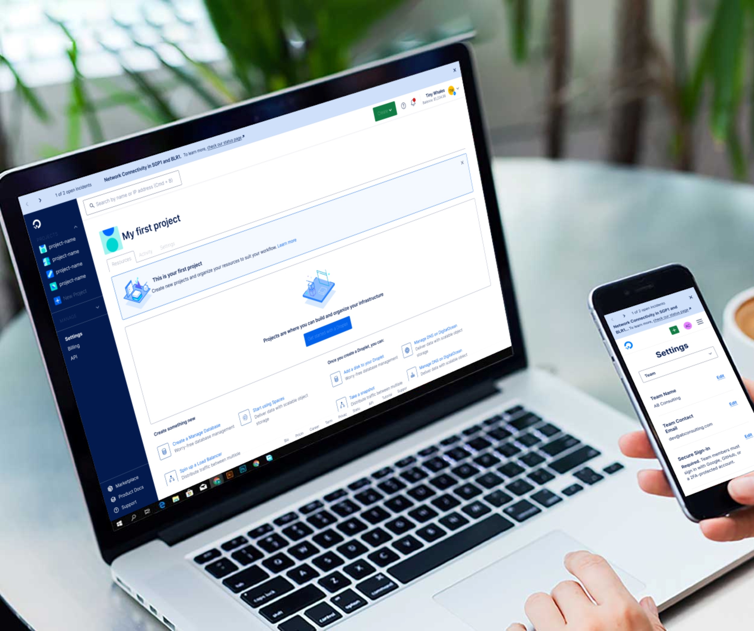
Status banner when a single incident is occurring
Status banner when a single incident is occurring
Status banner when a single incident is occurring
When there is a single incident occurring, the banner will display 'Open Incident'.
When there is a single incident occurring, the banner will display 'Open Incident'.
When there is a single incident occurring, the banner will display 'Open Incident'.
There will be a link to go to the status page if a user wants to learn more about the incident.
There will be a link to go to the status page if a user wants to learn more about the incident.
There will be a link to go to the status page if a user wants to learn more about the incident.
The name of the occurring incident will be highlighted in bold.
The name of the occurring incident will be highlighted in bold.
The name of the occurring incident will be highlighted in bold.

solution 2
solution 2
solution 2
Status banner when a multiple incidents are occurring
Status banner when a multiple incidents are occurring
Status banner when a multiple incidents are occurring
The number of on-going incidents will be displayed as '1 of 2 open incidents', for instance.
The number of on-going incidents will be displayed as '1 of 2 open incidents', for instance.
The number of on-going incidents will be displayed as '1 of 2 open incidents', for instance.
Two chevrons '< >' will be displayed on the left, allowing the user to navigate through all the on-going incidents.
Two chevrons '< >' will be displayed on the left, allowing the user to navigate through all the on-going incidents.
Two chevrons '< >' will be displayed on the left, allowing the user to navigate through all the on-going incidents.
Closing a banner will remove it from view, and reduce the number of on-going incidents.
Closing a banner will remove it from view, and reduce the number of on-going incidents.
Closing a banner will remove it from view, and reduce the number of on-going incidents.

Diving into the process
Diving into the process
Diving into the process
We followed a well planned process to identify key user problems through user interviews, using insights to ideate solutions and test them with users using findings to reiterate and come up with a final solution that solves key user problems.
We followed a well planned process to identify key user problems through user interviews, using insights to ideate solutions and test them with users using findings to reiterate and come up with a final solution that solves key user problems.
We followed a well planned process to identify key user problems through user interviews, using insights to ideate solutions and test them with users using findings to reiterate and come up with a final solution that solves key user problems.
Industry Research
Industry Research
Industry Research
Comparing other platforms
Comparing other platforms
Comparing other platforms
At this stage, I was really unsure of the best practices for status banners. To build a strong understanding of how status banners are implemented, I studied design systems like IMB's Carbon Design System, Adobe's Spectrum Design System, Uber's Base Design System to identify some common patterns and best practices.
At this stage, I was really unsure of the best practices for status banners. To build a strong understanding of how status banners are implemented, I studied design systems like IMB's Carbon Design System, Adobe's Spectrum Design System, Uber's Base Design System to identify some common patterns and best practices.
At this stage, I was really unsure of the best practices for status banners. To build a strong understanding of how status banners are implemented, I studied design systems like IMB's Carbon Design System, Adobe's Spectrum Design System, Uber's Base Design System to identify some common patterns and best practices.

Status Banner at Uber
Status Banner at Uber
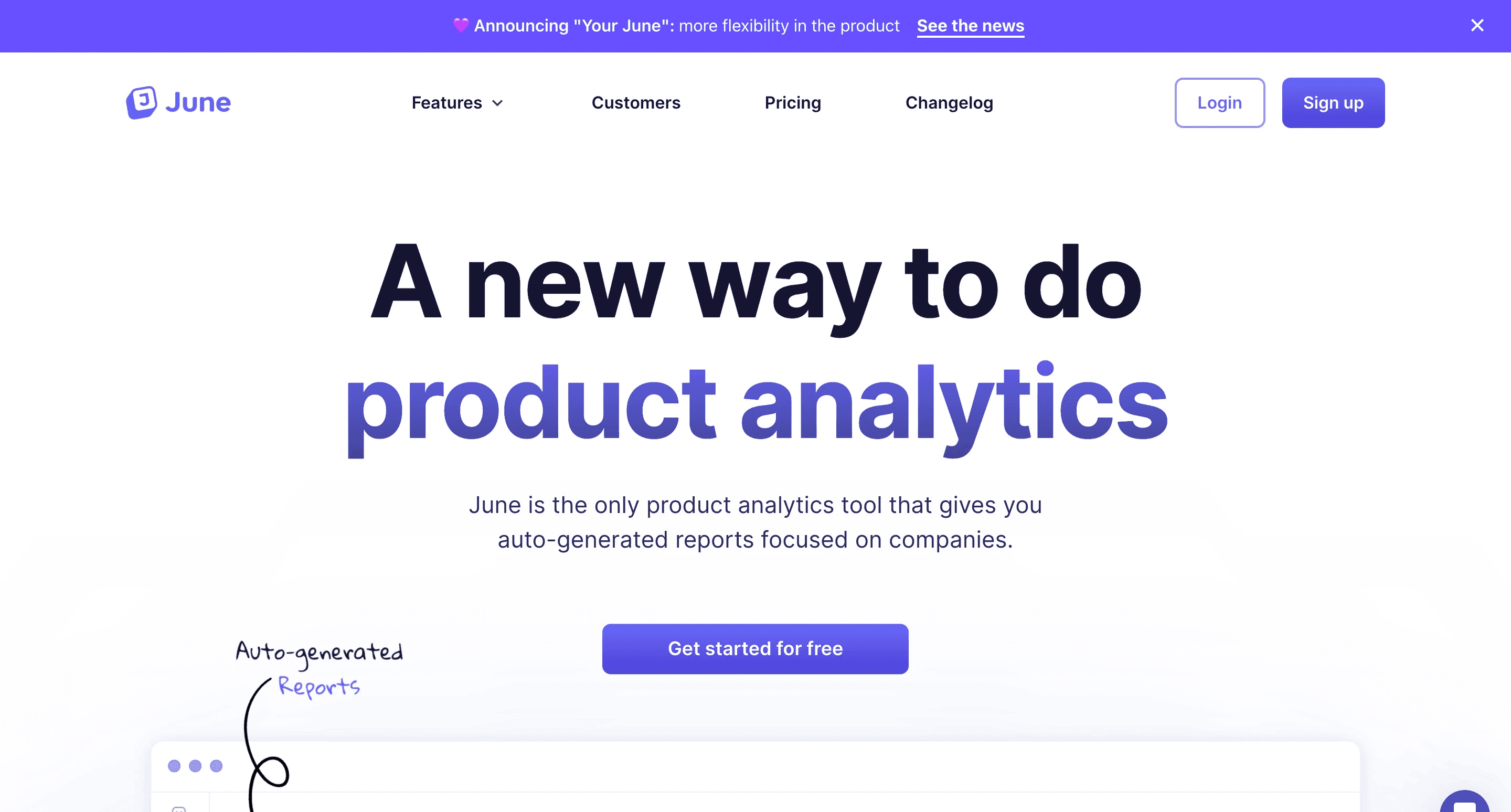
Status Banner at June
Status Banner at June

Status Banner at Chameleon
Status Banner at Chameleon

Status Banner at RocketShip
Status Banner at RocketShip
I learned that most companies followed a common pattern
I learned that most companies followed a common pattern
I learned that most companies followed a common pattern
01
01
01
Banners placed at top
Banners placed at top
Banners placed at top
Most companies placed their status banners at the top of the UI, ensuring they were immediately noticeable.
Most companies placed their status banners at the top of the UI, ensuring they were immediately noticeable.
Most companies placed their status banners at the top of the UI, ensuring they were immediately noticeable.
02
02
02
No sticky position applied
No sticky position applied
No sticky position applied
The banners did not use sticky positioning to prevent hiding essential UI elements at the top of the screen.
The banners did not use sticky positioning to prevent hiding essential UI elements at the top of the screen.
The banners did not use sticky positioning to prevent hiding essential UI elements at the top of the screen.
03
03
03
Severity indicated via colors
Severity indicated via colors
Severity indicated via colors
Various colors were used to indicate the severity of the incidents or alerts and catch user's attention.
Various colors were used to indicate the severity of the incidents or alerts and catch user's attention.
Various colors were used to indicate the severity of the incidents or alerts and catch user's attention.
Problem Statement
Problem Statement
Problem Statement
DigitalOcean's status banners currently fail to provide targeted, concise information during incidents, leading to user distraction and dissatisfaction due to irrelevant alerts, information overload, and banner stacking, which disrupt the essential user interface and experience.
DigitalOcean's status banners currently fail to provide targeted, concise information during incidents, leading to user distraction and dissatisfaction due to irrelevant alerts, information overload, and banner stacking, which disrupt the essential user interface and experience.
DigitalOcean's status banners currently fail to provide targeted, concise information during incidents, leading to user distraction and dissatisfaction due to irrelevant alerts, information overload, and banner stacking, which disrupt the essential user interface and experience.
wireframes
wireframes
wireframes
Exploring various solutions
Exploring various solutions
Exploring various solutions
I used what I learned from industry research to sketch some ideas quickly and explore some variations of the status banner that would best suit our use case at DigitalOcean, ensuring they were less intrusive to our users.
I used what I learned from industry research to sketch some ideas quickly and explore some variations of the status banner that would best suit our use case at DigitalOcean, ensuring they were less intrusive to our users.
I used what I learned from industry research to sketch some ideas quickly and explore some variations of the status banner that would best suit our use case at DigitalOcean, ensuring they were less intrusive to our users.
Version 01
Version 01
Version 01
Carousel style banner
Carousel style banner
Carousel style banner
I designed a banner for a single incident. Then I worked on a way to display multiple statuses using a carousel so that users could switch between multiple on-going incidents using the chevrons to move between them. This eliminated the need for stacked banners.
I designed a banner for a single incident. Then I worked on a way to display multiple statuses using a carousel so that users could switch between multiple on-going incidents using the chevrons to move between them. This eliminated the need for stacked banners.
I designed a banner for a single incident. Then I worked on a way to display multiple statuses using a carousel so that users could switch between multiple on-going incidents using the chevrons to move between them. This eliminated the need for stacked banners.


Version 02
Version 02
Version 02
Accordion style banner
Accordion style banner
Accordion style banner
Multiple status banners appear as an accordion. If a user is affected by an incident, they can expand the accordion to look at the current on-going incidents. They can then go to the Status page to view more details.
Multiple status banners appear as an accordion. If a user is affected by an incident, they can expand the accordion to look at the current on-going incidents. They can then go to the Status page to view more details.
Multiple status banners appear as an accordion. If a user is affected by an incident, they can expand the accordion to look at the current on-going incidents. They can then go to the Status page to view more details.
Version 03
Version 03
Version 03
Pop-up style banner
Pop-up style banner
Pop-up style banner
Displaying a popup under notifications bell was another idea I explored. The idea was to take the user to the notifications page where they could read more about the on-going incident and take necessary actions if applicable.
Displaying a popup under notifications bell was another idea I explored. The idea was to take the user to the notifications page where they could read more about the on-going incident and take necessary actions if applicable.
Displaying a popup under notifications bell was another idea I explored. The idea was to take the user to the notifications page where they could read more about the on-going incident and take necessary actions if applicable.

iterations
iterations
iterations
Improving the designs based on feedback from team
Improving the designs based on feedback from team
Improving the designs based on feedback from team
I turned to the product, design and engineering teams for feedback. The teams really liked the carousel-style banner since it solved the problem of stacked banners and limited the amount of information. However, there were some updates that could make the banners even better.
I turned to the product, design and engineering teams for feedback. The teams really liked the carousel-style banner since it solved the problem of stacked banners and limited the amount of information. However, there were some updates that could make the banners even better.
I turned to the product, design and engineering teams for feedback. The teams really liked the carousel-style banner since it solved the problem of stacked banners and limited the amount of information. However, there were some updates that could make the banners even better.
I received the following feedback from the team:
I received the following feedback from the team:
I received the following feedback from the team:
Too much content still in the banners
Too much content still in the banners
Too much content still in the banners
The banners were still information heavy and could improve with prioritization of information.
The banners were still information heavy and could improve with prioritization of information.
The banners were still information heavy and could improve with prioritization of information.
Blue color was too prominent
Blue color was too prominent
Blue color was too prominent
The bright blue color of the banner was still very attention grabbing and could be toned down.
The bright blue color of the banner was still very attention grabbing and could be toned down.
The bright blue color of the banner was still very attention grabbing and could be toned down.
Improve chevron placement
Improve chevron placement
Improve chevron placement
The chevrons worked well to eliminate stacked banners, but felt too far apart for ease of use.
The chevrons worked well to eliminate stacked banners, but felt too far apart for ease of use.
The chevrons worked well to eliminate stacked banners, but felt too far apart for ease of use.
Banner height felt too big
Banner height felt too big
Banner height felt too big
The banners still felt very tall on the UI and took up valuable space which could be reduced.
The banners still felt very tall on the UI and took up valuable space which could be reduced.
The banners still felt very tall on the UI and took up valuable space which could be reduced.
With the feedback received, I made the following update to the banners:
With the feedback received, I made the following update to the banners:
With the feedback received, I made the following update to the banners:
Before
Before
Before

After
After
After

user testing
user testing
user testing
We used A/B testing method to analyze the new banners
We used A/B testing method to analyze the new banners
We used A/B testing method to analyze the new banners
To measure the impact of the new design, we used Optimizely to run A/B tests for a duration of two weeks. We divided our users into two target groups: Control and Treatment. Control users saw the old banner design, while Treatment users were exposed to the new design.
To measure the impact of the new design, we used Optimizely to run A/B tests for a duration of two weeks. We divided our users into two target groups: Control and Treatment. Control users saw the old banner design, while Treatment users were exposed to the new design.
To measure the impact of the new design, we used Optimizely to run A/B tests for a duration of two weeks. We divided our users into two target groups: Control and Treatment. Control users saw the old banner design, while Treatment users were exposed to the new design.
We gathered the following metrics from user testing
We gathered the following metrics from user testing
We gathered the following metrics from user testing
143%
143%
143%
Higher click-through rate
Higher click-through rate
Higher click-through rate
80%
80%
80%
Higher acceptance rate
Higher acceptance rate
Higher acceptance rate
retrospective
retrospective
retrospective
Final thoughts and take aways
Final thoughts and take aways
Final thoughts and take aways
take away 1
take away 1
take away 1
Gather better metrics
Gather better metrics
Gather better metrics
Due to the 2-week duration of our A/B test, we only collected metrics during a single incident. A longer test could provide a more robust set of data.
Due to the 2-week duration of our A/B test, we only collected metrics during a single incident. A longer test could provide a more robust set of data.
Due to the 2-week duration of our A/B test, we only collected metrics during a single incident. A longer test could provide a more robust set of data.
take away 2
take away 2
take away 2
Targeted alerts
Targeted alerts
Targeted alerts
In the future, we intend to implement targeted banners to provide a more tailored user experience. Only users affected by a particular incident would receive notifications, reducing irrelevant alerts.
In the future, we intend to implement targeted banners to provide a more tailored user experience. Only users affected by a particular incident would receive notifications, reducing irrelevant alerts.
In the future, we intend to implement targeted banners to provide a more tailored user experience. Only users affected by a particular incident would receive notifications, reducing irrelevant alerts.
take away
take away
take away
Color coded banners
Color coded banners
Color coded banners
We're also looking at aligning the banner colors with the types of incidents, a practice commonly observed in the industry.
We're also looking at aligning the banner colors with the types of incidents, a practice commonly observed in the industry.
We're also looking at aligning the banner colors with the types of incidents, a practice commonly observed in the industry.