


My Role
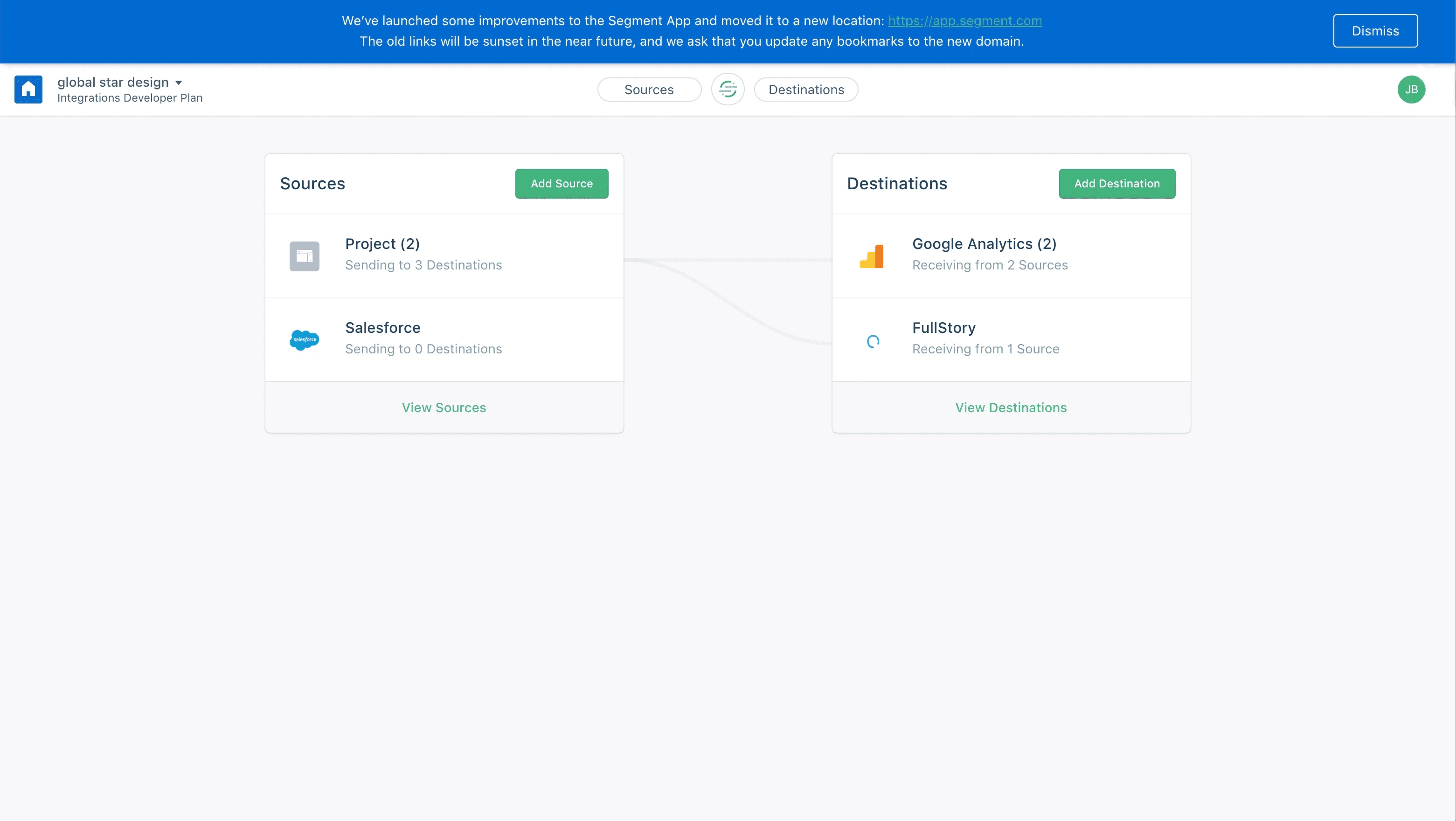
While working for the Growth team at DigitalOcean, I was tasked with redesigning DigitalOcean's status banner which was used across the entire platform and served as an essential part of keeping their users informed of any disruptions.
Timeline
Tools
Figma and Miro
Process
• Discovery
• Industry Research
• Ideation
• Wireframing
• Prototyping
• User Testing
• Handoff
Problem
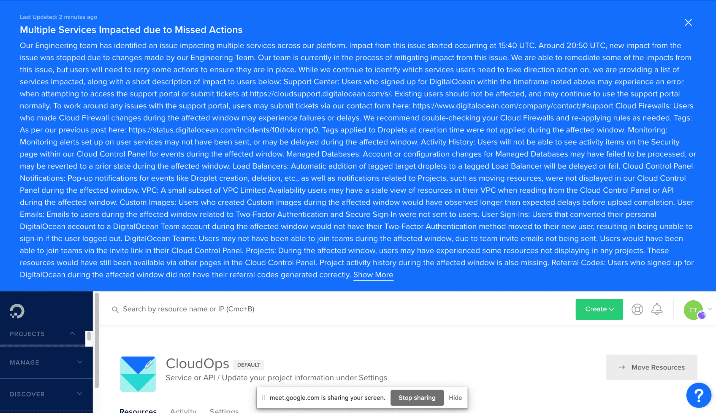
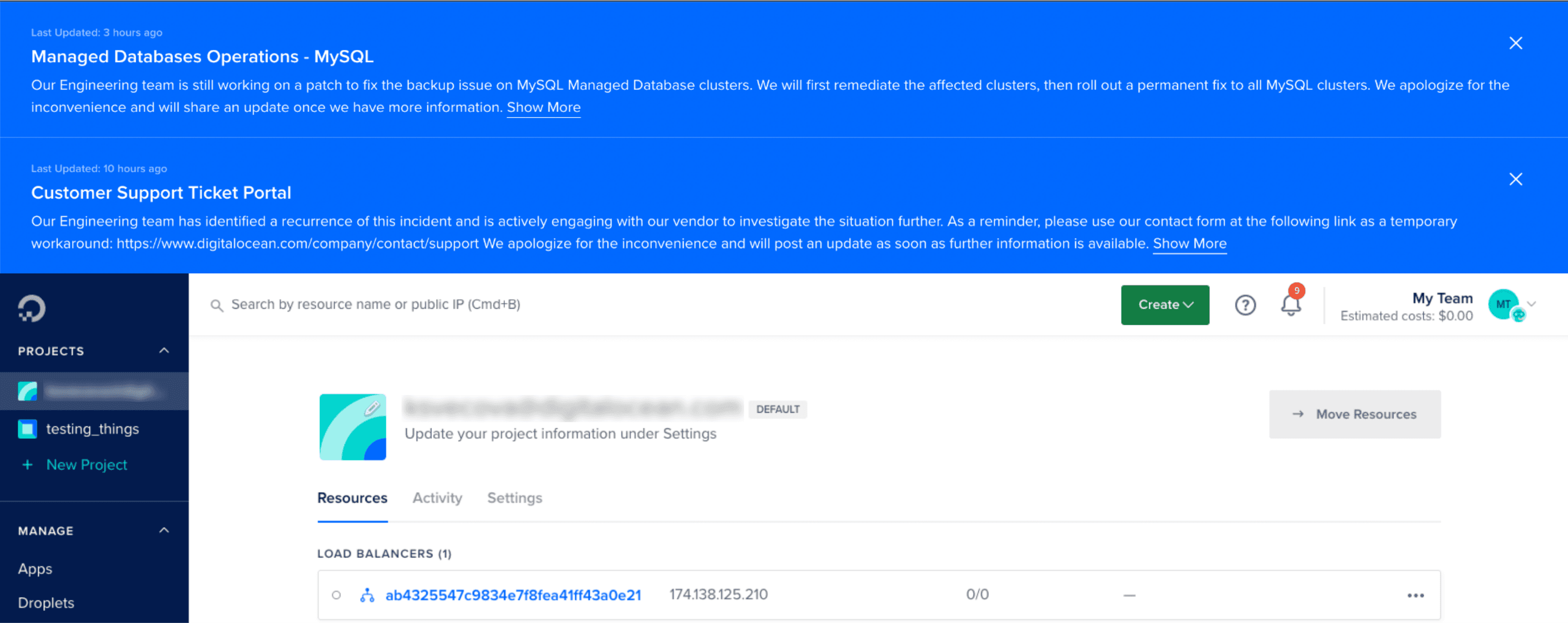
The global status banner at DigitalOcean was implemented over a decade ago. As the platform expanded, these once-effective banners began delivering irrelevant alerts to users not involved in ongoing incidents and obstructed the UI.
The banners started cluttering the interface and disrupting user interaction. This problem led to significant frustration among users, contributing to an increase in churn rates.
Solution
I revamped the status banner at DigitalOcean to be more user-centric and less intrusive. The redesign focused on improving the user interface, ensuring that the banner was informative yet unobtrusive, enhancing overall user interaction with the platform.
This redesign led to significant improvements in comparison to the existing banner, as evidenced by a 143% higher click-through rate and 80% higher acceptance rate.
Final Deliverable

Problem Discovery
The existing banners suffered from showing irrelevant alerts and excessive information
The product manager handed me a project requirements document (PRD) that included a comprehensive list of issues with our status banner, as discovered by the Research team. After analyzing the document, I identified the following key issues.
Showing irrelevant alerts to customers
Instead of being tailored, the banner displayed alerts to all users, regardless of their relevance.
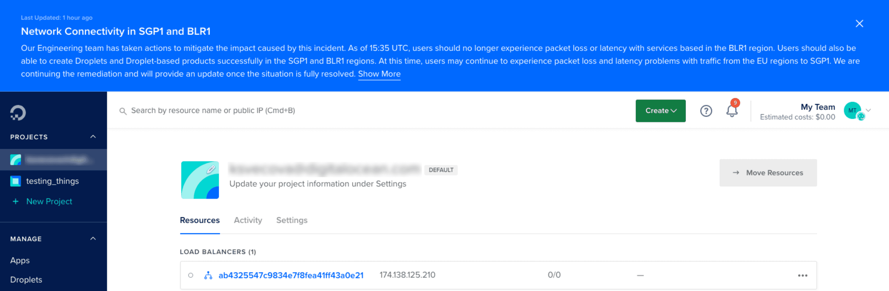
Displaying excessive information
The automated status updates often presented a prolonged text wall, thereby pushing the core UI elements down, disrupting user experience.
Stacking banners during multiple on-going incidents
During multiple incidents, banners stacked over each other.
There was also no limit to how many banners could stack at any particular time.
Industry Research
I compared design systems to learn how other companies implemented status banners
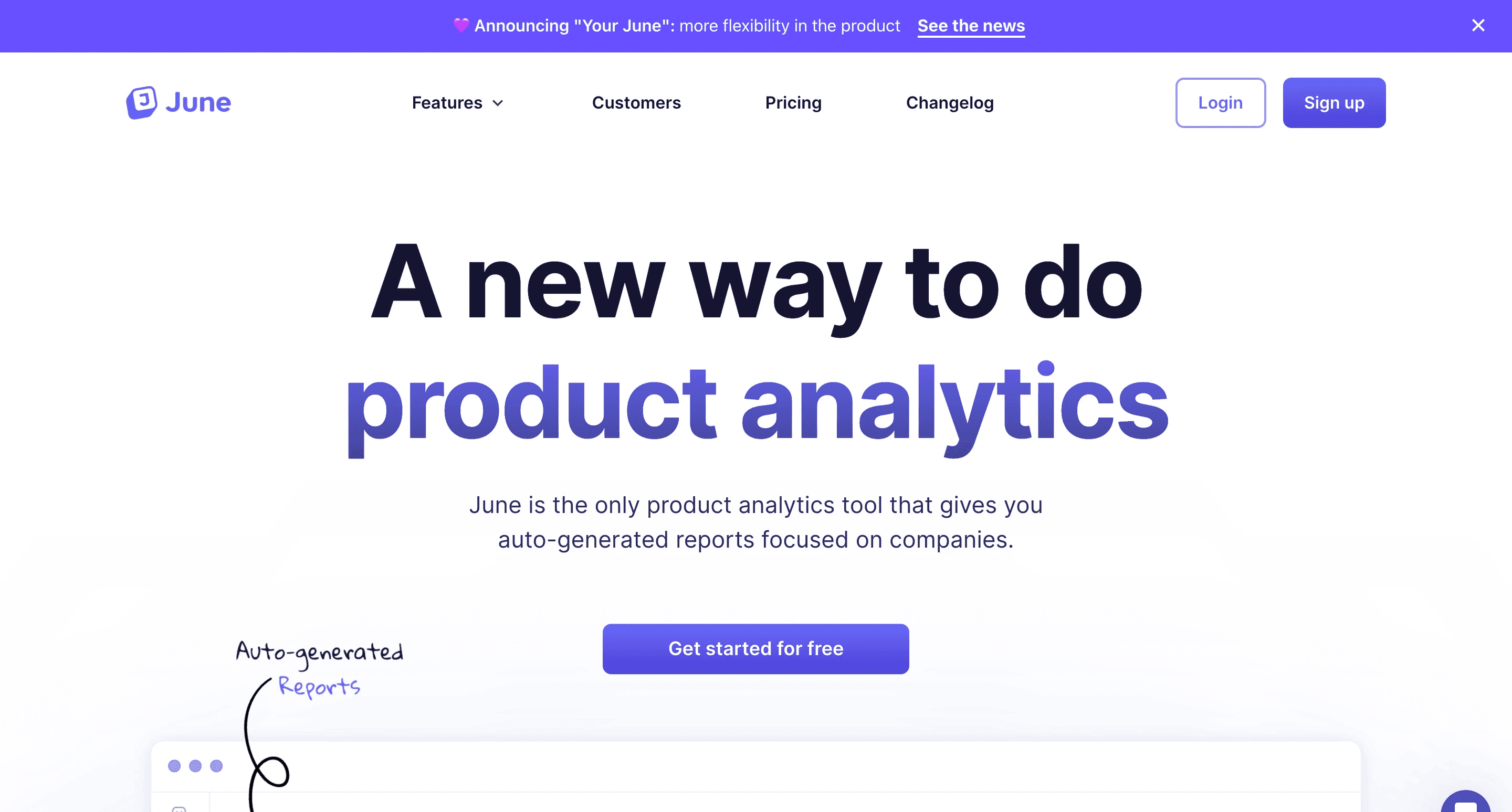
At this stage, I was really unsure of the best practices for status banners. To build a strong understanding of how status banners are implemented, I studied design systems like IMB's Carbon Design System, Adobe's Spectrum Design System, Uber's Base Design System to identify some common patterns and best practices.

Status Banner at Uber
Status Banner at June

Status Banner at Chameleon

Status Banner at RocketShip
I learned that most companies followed a common pattern
Top Placement
Most companies placed their status banners at the top of the UI, ensuring they were immediately noticeable.
No sticky position
The banners did not use sticky positioning to prevent hiding essential UI elements at the top of the screen.
Color coded
Various colors were used to indicate the severity of the incidents or alerts and catch user's attention.
Stacked banners
For multiple ongoing incidents, the banners were stacked, ensuring all alerts were visible to the users.
Ideation and Lo-fidelity prototyping
I sketched various ideas and converted them into lo-fidelity prototypes for early feedback
I used what I learned from industry research to sketch some ideas quickly, and transformed them into lo-fidelity prototypes that would help me engage in discussions and recieve feedback.
Carousel
I designed a banner for a single incident. Then I worked on a way to display multiple statuses using a carousel so that users could switch between multiple on-going incidents using the chevrons to move between them. This eliminated the need for stacked banners.

Accordion
Multiple status banners appear as an accordion. If a user is affected by an incident, they can expand the accordion to look at the current on-going incidents. They can then go to the Status page to view more details.

Pop-up Notification
Displaying a popup under notifications bell was another idea I explored. The idea was to take the user to the notifications page where they could read more about the on-going incident and take necessary actions if applicable.

Since the limited scope didn't allow me to test these designs early with users, I turned to the product, design and engineering teams for feedback instead.
Feedback and Iterations
The carousel-style banner was preferred over other designs, but it required some improvements
The teams really liked the carousel-style banner since it solved the problem of stacked banners and limited the amount of information. However, there were some updates that could make the banners even better.
Feedback received on the carousel-style banner
Banner Height
The team felt the banners were still too tall and took up too much of screen space in the UI.
Excessive Content
The banners were still information heavy and could improve with prioritization.
Chevron Placement
The chevrons worked well to eliminate stacked banners, but felt too far apart for ease of use.
After receiving the feedback, I went back to reiterate on the carousel-style banner and created the following prototype to test its functionality within the control panel and go through another round of review with the teams.

Final Design
Creating a final hi-fidelity prototype after another round of user feedback and iterations
After presenting the updated prototype to the design, product and engineering teams, I received further feedback to enhance the functionality, usability and aesthetics of the status banner.
I made the following updates to the final status banner
Chevron Placement
To streamline the experience, I decided to place them closer together and to the left of the banner.
Color Contrast
I shifted from the original, more vivid blue to a muted tone making the banner less intrusive but visually distinct.
Mobile Layout
The engineering team emphasized that the touchable area for the chevrons should be at least 48 pixels.
Link Out
The link in the banner required navigating users to the global status page instead of a page for the incident.

How do we display the global status banner during single and multiple on-going incidents?
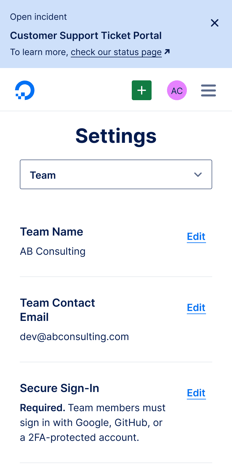
Single Incident Banner
When there is a single incident occurring, the banner will display 'Open Incident'.
The name of the occurring incident will be highlighted in bold.
There will be a link to go to the status page if a user wants to learn more about the incident.
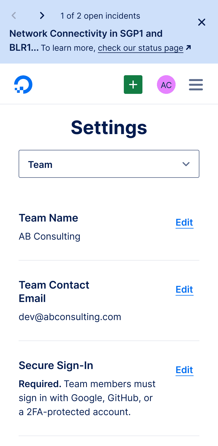
Multiple Incidents Banner
For multiple on-going incidents, the banner will switch to a different layout.
Two chevrons '< >' will be displayed on the left, allowing the user to navigate through all the on-going incidents.
The number of on-going incidents will be displayed as '1 of 2 open incidents', for instance.
Closing a banner will remove it from view, and reduce the number of on-going incidents.
How would the global status banner behave responsively on mobile screens and adapt to screen sizes?
Single Incident Banner
The status banner would move the content into 3 lines
The first line would show an 'Open Incident' messsage
The second line would display the name of the incident
The third line would provide a link to the status page
Multiple Incidents Banner
For multiple on-going incidents, the banner would display the chevrons '< >' next to the number of on-going incidents.
When the incident name does not fit into a single line, it will move to the next line and get truncated.
The status page link will be displayed in full.
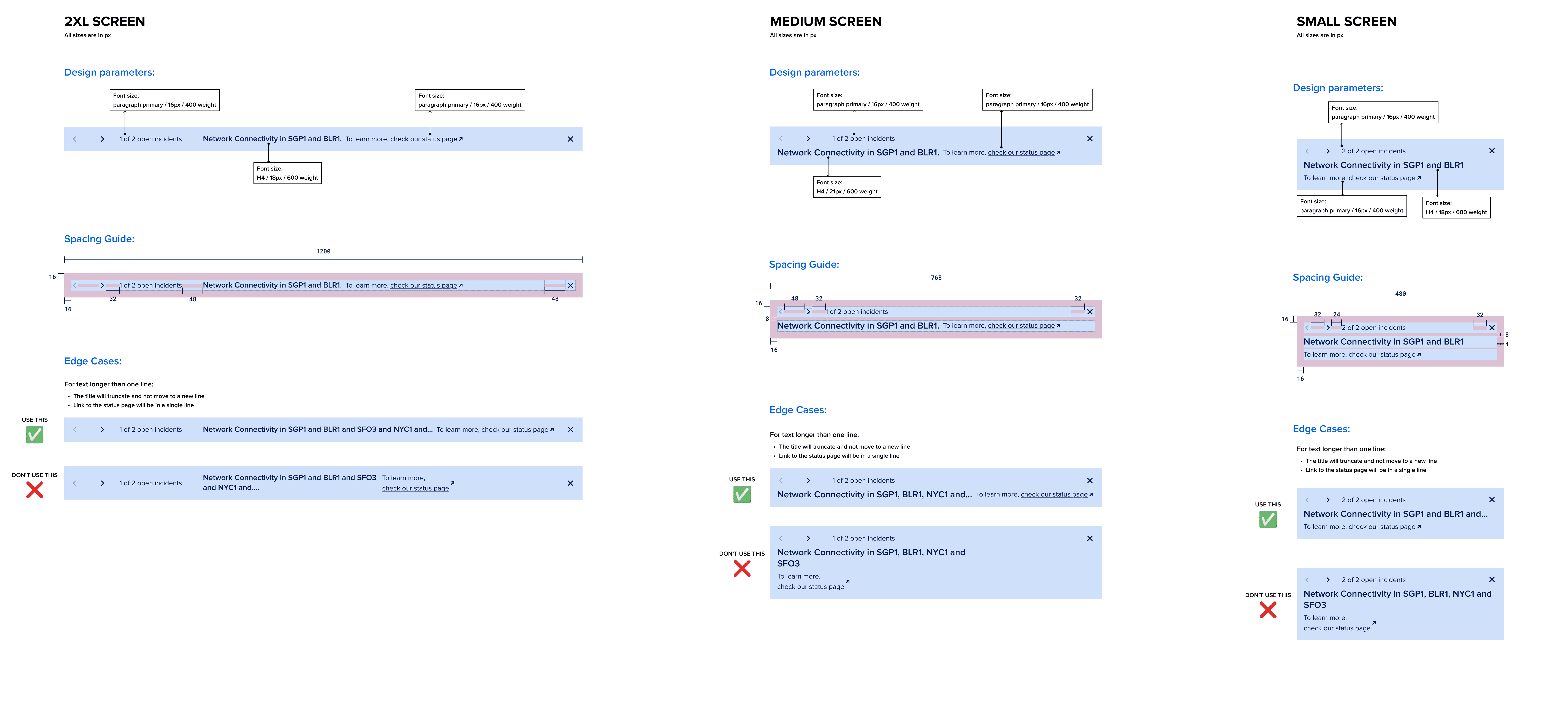
Developer Handoff
After the final designs, I created detailed annotations for the engineers to accurately implement the design in code
During the handoff, I worked with Michelle and Kristina to create some detailed annotations to make it easier for them to implement the designs in code. I annotated my designs for different screen sizes - 2XL, Medium, and Small, documenting details on how the banners would behave responsively.
I outlined the following details in my annotations
Design Parameters
I provided exact font sizes, weights, and color codes, for consistent implementation across platforms.
Spacing Guide
Measurements for padding, margins, and element spacing were detailed to maintain the structural integrity
Edge Cases
Instructions for text overflow and link behavior were included to handle various content lengths and ensure usability.
Usage Guidelines
Visual examples demonstrated the dos and don'ts, offering clear direction on the intended design.
User Testing
We launched the new banner to 50% of users to conduct A/B tests and gathered positive metrics
To measure the impact of the new design, we used Optimizely to run A/B tests for a duration of two weeks.
We divided our users into two target groups: Control and Treatment. Control users saw the old banner design, while Treatment users were exposed to the new design.
Metrics gathered from testing the new banner with our users
✅ 143%
Higher click-through rate
✅ 80%
Higher acceptance rate
The metrics showed that the new banner design was more user friendly and less obtrusive to a user's workflow. Having received a positive score, we launched the banner to all our customers and is currently live at DigitalOcean.
Reflection and Next Steps
Project Success and Future Plans for Refined User Notification Strategy
The project was a resounding success, but there's still room for improvement. Due to the 2-week duration of our A/B test, we only collected metrics during a single incident. A longer test could provide a more robust set of data.
In the future, we intend to implement contextual banners to provide a more tailored user experience. Only users affected by a particular incident would receive notifications, reducing irrelevant alerts.
We're also looking at aligning the banner colors with the types of incidents, a practice commonly observed in the industry. This project was an excellent learning opportunity, and the results have laid the groundwork for upcoming improvements, particularly the anticipated Status Page revamp.